


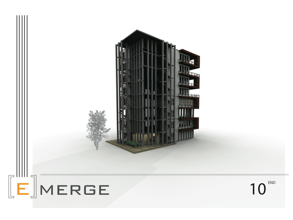
Diving right into jenga 5.0 our group had two one-hour charrettes with group allure as well as group angling. We began with team allure discussing one another’s concepts and how they couple potentially merge to create one design voice. Once we had an idea of how we wanted to go about creating the eight-story structure we paired up and began working on required deliverables. Since team allure had a larger structure it was more fitting for our unit to sit on top. We then united the structures by extending team allures main design feature ( the row of columns) along the facade of our unit. We also continued our main design feature, the “c’s” on team allures unit my enclosing their balconies with a similar structure.
Moving into the second charrette we were paired with team angling. We took a similar approach while working with this team as we did with team allure. However we found it a bit more difficult to create a language that spoke to each groups design concept. Our unit has a heavy emphasis on materiality as well as clean strait lines while team angling sought out to dematerialize there unit and create a network of protruding angles. How did come to an agreement that the “c’s” found on our unit should also be present in team anglings unit while there almost snake like in nature structure that encompassed there unit should rise all eight stories.
Dajana
While reviewing Dajana’s work, three clear and distinct concepts for each space based on the idea of squeezed, have emerged. In the smallest space the concept of a rain forest was deployed. Using a series of vertical elements to divide the space one may feel as though they are “squeezing through the rainforest floor as the navigate their way around this space. The second space being the 22’ x 22’ frame utilized two walls and one column. With the walls tucked away in the corner perpendicular to one another the patron is forced to constantly be shifting axis’ while moving through out the space. The third and largest space likely did the best job bringing the concept of “squeeze to fruition. Using a curved wall that spirals through the space, Dajana was able to create niches that provided room for sleeping eating and bathing while forcing the user to squeeze their way around the space.
I found that from a presentation stand point Dajana was well spoken and there was an easy connection between her verbal communication and her visual communication. Out of the collection of drawings the axonometric drawings most successfully communicated the intent of the designer.
Focusing on the word tilt Jamaan designed three spaces that were unique in there own way while still liking together. In the smallest space two ramps flank each wall allowing for a smooth level change as well as utilizing the theme tilt. There are also two columns that lean in opposite directions reinforcing the theme. In the square space two solids that were used were in the form of vertically ckurved walls. Although there could have been a better solution in dividing the space up, the walls very strongly engaged feelings of tilt. In the largest space two walls that intersect punctuated by a column were used to in engage a feeling of tension. Although this was the weakest space conceptually the space seemed the most “livable”” of all three.
Out of all of the drawings I found that the perspectives along with the models helped me best understand the space. Each of these communication tools successfully showed use of light and materiality.


